SRE and predictive analysis
Table of contents
- Introduction
- Predictive Analysis
- What is our goal
- Analysis
- Putting everything into practice
- Linking predictive analysis with SRE
Introduction
Site Reliability Engineering (SRE) as a practice has enabled us to consistently and reliably detect and react to significant events affecting our services over the years. However, as a process, SRE is largely reactive. Even though its value cannot be overstated, there is always room for improvement.
The best way to prevent an outage is to anticipate it — and to never allow it to happen in the first place.
This transforms SRE from a reactive process to a predictive one.
Even if we cannot predict with 100% certainty when a problem will occur, being able to estimate it approximately — within a reasonable level of confidence — is still valuable. It allows us to raise awareness in advance, so that the person on call can anticipate potential issues, remain alert, and intervene early to mitigate or even prevent the problem before it escalates.
This is what we will explore in this article: building a bridge between traditional Site Reliability Engineering and the scientific discipline of predictive analysis.
Predictive Analysis
Predictive analysis is the process of using statistical methods to analyse data related to a specific product, market, service, or phenomenon, and then applying those insights to predict future events. It employs a range of techniques that have been extensively documented across various industries.
One of the best resources available online is the NIST/SEMATECH e‑Handbook of Statistical Methods, which provides a solid overview of these techniques and includes step‑by‑step guidance on how to evaluate and fine‑tune each method in order to identify the most appropriate one for a given case.
What is our goal
Our goal is to use the data produced by our service to create a predictive model that allows us to extrapolate from past behaviour and forecast future outcomes.
This can be achieved in several ways. In this article, we will focus on one approach, with alternative methods to be discussed in future articles.
Analysis
Collecting data
To perform this analysis, we need a dataset capturing the past behaviour of a specific aspect of our service. This dataset can take many forms — for example, logs or metrics.
Generally speaking, we need to divide our dataset into two parts: good or acceptable events versus bad or unacceptable events.
For instance, let’s say we want to focus on the latency of an interface. Latency is a continuous metric; it is not a binary one that easily allows us to assign a value of 0 to “bad” and 1 to “good” and split our dataset accordingly. However, we can simulate this binary behaviour by defining a threshold and classifying any value above it as “bad” and any value below it as “good.”
This approach allows us to isolate all the bad events, including their corresponding timestamps.
Aggregating our data
After filtering out the bad events over time, we now need to transform the data further to determine their frequency within a specific period. This step effectively groups and counts the bad events over defined intervals, giving us a rate — for example, events per second, per minute, per hour, and so on.
We can think of these periods as “buckets” that collect all events occurring within their duration.
This process allows us to produce a histogram showing the distribution of these events over time.
Fitting our data
Now we come to the core of the methodology. We have our event histogram — is there a way to find a mathematical function that fits our dataset and can be used for forecasting?
This is where regression methods and curve fitting come into play. We use these techniques to find a mathematical function or numerical model that expresses the behaviour of our service, either mathematically or numerically.
This task is not new; there are well‑established methods for performing it. Several well‑known regression techniques can help us find the best match for our dataset across a variety of mathematical function families. This functionality even exists in some calculators, which can perform curve fitting and determine the best match across seven or eight categories of mathematical functions.
Modern mathematical and statistical software is even more powerful. We can perform extensive curve fitting using MATLAB, R, SageMath, or even plain Python with libraries such as Pandas, SciPy, or Scilab.
Dangers of overfitting
Whenever performing curve fitting, there is always a risk of overfitting the data. When this happens, the model hugs the dataset too closely, matching precisely all the variations in the histogram. While this might look impressive visually, it is not useful for forecasting. Such a model captures all the noise and fails to allow for natural variation, leading to poor generalisation, misleading conclusions, and unstable behaviour.
The NIST Engineering Statistics Handbook warns about the dangers of overfitting. It recommends testing residuals to ensure they do not follow recognisable patterns, and validating the model by using it to predict future values before rolling it out to production.
In our example, we will test several models and compare their fit using the following criteria:
- \(R^2\) — coefficient of determination. The fraction of variance in our observed values that the model explains. It ranges from 0 to 1 (or 0–100%). A higher \(R^2\) indicates a better in‑sample fit but does not guarantee accurate predictions or freedom from overfitting.
- RMSE (Root Mean Square Error) — The square root of the average squared error; effectively the standard deviation of the residuals. Lower is better.
- MAE (Mean Absolute Error) — The average of the absolute differences between actual and predicted values. Lower is better.
- AIC (Akaike Information Criterion) — A model selection score that trades off fit and complexity. It is based on likelihood with a penalty for the number of parameters. When two models fit similarly, AIC tends to favour the simpler one, helping to avoid overfitting compared to relying solely on \(R^2\) or RMSE.
- BIC (Bayesian Information Criterion) — Similar to AIC but with a stronger penalty for model complexity (the penalty scales with the logarithm of the sample size). It tends to favour models with lower complexity.
Using our model
Now that we have a working model that fits our data to a certain extent, we can use it for two purposes.
First, we can determine which part of the cycle we are currently in, and second, we can predict spikes of unwanted events within a certain level of confidence. Depending on the nature of the model, we may have more than one solution. If our model is periodic, this means that recurring cycles exist.
This can be tricky because, depending on the situation, our period may be too long; if we do not have sufficient data to feed into the model, we may be unable to detect it. For example, if our dataset spans one month but the period is six months, there is no way to extrapolate meaningful predictions from such limited data.
On the other hand, if the data exhibit a shorter period of a few days, then a one‑month dataset is usually more than enough to establish a clear pattern.
If we end up with a functional model that includes timestamps, we can use it to determine exactly where we are in the periodic cycle — which means we can easily predict when the next spike or spikes will occur and remain extra vigilant.
Alternatively, if we do not have timestamps, we can rely on pattern matching. We can collect a small number of samples, group them into buckets, and then use the model to identify which part of the cycle we are currently in through pattern comparison.
Putting everything into practice
After describing the methodology, it makes sense to provide an example. We will apply the methodology to analyse one of my personal services — a GoToSocial instance with a single user.
For those unfamiliar with it, GoToSocial is an ActivityPub social networking server. It is written in Go and is lightweight enough to be hosted even on a Raspberry Pi. Despite the small size of the service, it is quite active and federates with hundreds of other ActivityPub instances, making it a realistic example of a small‑scale, real‑world application.
The data used are real, not synthetic. We will work with logs spanning the period from the 25th of February 2026 to the 1st of April 2026.
Presenting the error histogram
After collecting our logs for the above period, we apply the first step: identifying the errors and splitting our data into hourly buckets. This yields a dataset of 886 buckets.
We can see these buckets presented in the following histogram:
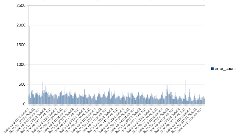
Even without any further processing, we can see macroscopically that there is some periodicity. So we expect our model to reflect that in some way.
The challenge now is to determine which category of functions is best for our model and, after selecting a family, what kind of fine-tuning we can perform to improve the fit even further.
Trying the trigonometric family
We can see that the dataset has a periodicity that appears to be daily, and it could potentially be fitted nicely with trigonometric functions. So this is what we will attempt first. For the curve fitting in this case, we use the NumPy library and, specifically, the linalg.lstsq function.
24h period
So this is what we will attempt first. Let’s try fitting a trigonometric function with four harmonics and a period of 24 hours. This gives us a fit with the following properties:
Period hours: 24.0
Harmonics: 4
R^2: 0.11478812632316349
Coefficients:
c0=206.5702885675613
c1=-45.11000222890022
c2=1.6343756945694634
c3=-2.0343489352492035
c4=-6.241474170882098
c5=-10.811558832427124
c6=-1.6575425592831072
c7=1.5152724170962195
c8=-0.8161734650591257
and the following fit:
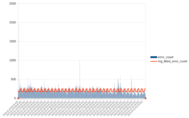
We can verify both visually and from the fairly low \(R^2\) value that the fit is not great — we are only capturing 11% of the observed values.
7-day (168h) period
Repeating the experiment with a 7-day period (168 hours):
Period hours: 168.0
Harmonics: 4
R^2: 0.03184541598545587
Coefficients:
c0=205.8633790794272
c1=16.795771629288875
c2=-8.342650759251661
c3=12.435800671861827
c4=8.168719034649968
c5=5.798148151755778
c6=3.0422911601659615
c7=-2.686076356710398
c8=1.0882103037176767
and the following fit:
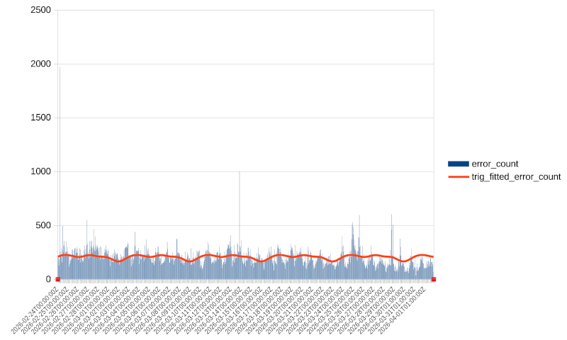
We can see that even though \(R^2\) is much better than the previous fit, a visual inspection reveals that the fit is actually worse. The projection misses much of the variability in our data.
Comparing different model families
After presenting the two trigonometric options, one may wonder what else we can do.
The answer is that we can create a script that compares many different model families and many different configurations within each family. I have done a test run with 43 different models from different families; here are the best performers:
Tested models: 43
Valid models: 43

Ranked valid models
===================
1. spline_s_auto
   R^2: 0.999896
   RMSE: 0.999504
   MAE: 0.435485
   AIC: 7.121179
   BIC: 26.263530
   Parameters: {'smoothing_factor': None}

2. spline_s_885
   R^2: 0.999896
   RMSE: 0.999504
   MAE: 0.435485
   AIC: 7.121179
   BIC: 26.263530
   Parameters: {'smoothing_factor': 885}

3. spline_s_850623.5396610169
   R^2: 0.900018
   RMSE: 30.999789
   MAE: 24.508399
   AIC: 6086.145327
   BIC: 6105.287677
   Parameters: {'smoothing_factor': np.float64(850623.5396610169)}

4. ets_add_add_s168
   R^2: 0.363532
   RMSE: 78.214129
   MAE: 41.467808
   AIC: 7736.227036
   BIC: 7784.082912
   Parameters: {'trend': 'add', 'seasonal': 'add', 'seasonal_periods': 168}
As we can see, the top three models belong to the same category but with different smoothing factors. The best performers belong to the spline category. The spline family of equations can be used for curve fitting, but these results are a textbook example of overfitting.
We can see that these models capture 99.98% of our dataset. If we graph one of these fits, it looks like this:
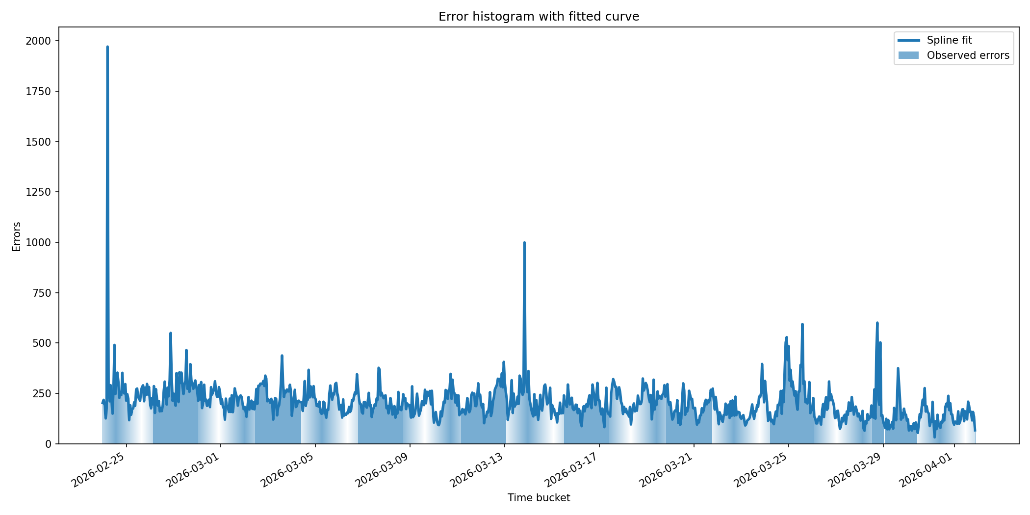
We can see that the spline fits even random noisy spikes. If we plot the residuals, they look like this:
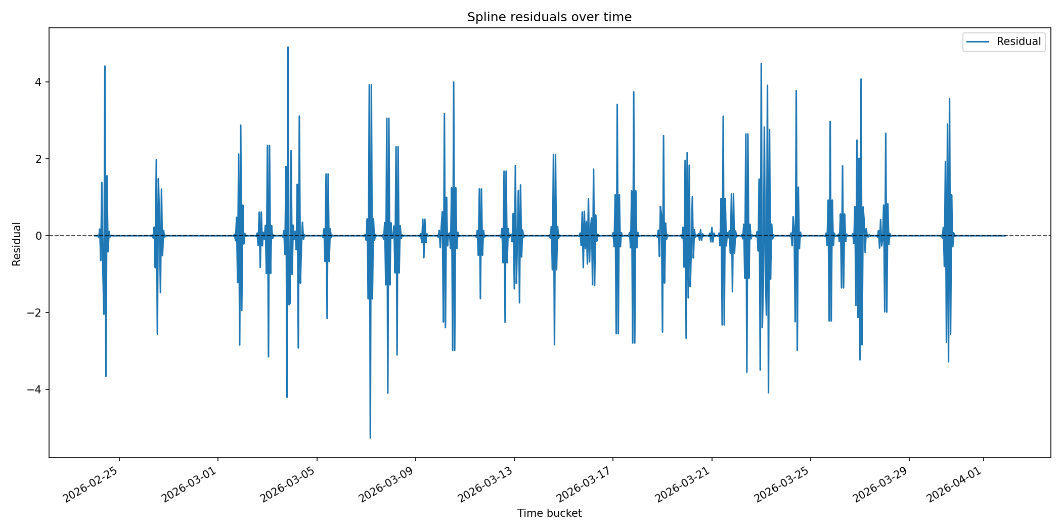
We can see that for the majority of our samples, the residuals are zero. This is exactly what the guidance in the NIST Engineering Statistics Handbook warns against, and something we must avoid. Splines are useful as visualisation tools — especially with a smoothing factor — but they are not great for forecasting.
This is why the best fit is really model no. 4, which belongs to a family of functions called ETS (Error-Trend-Seasonality). This family of models is best described in this OpenForecast link by Ivan Svetunkov, a Senior Lecturer in Lancaster University Management School, who has written an excellent monograph on the topic — not only for ETS models but for forecasting in general.
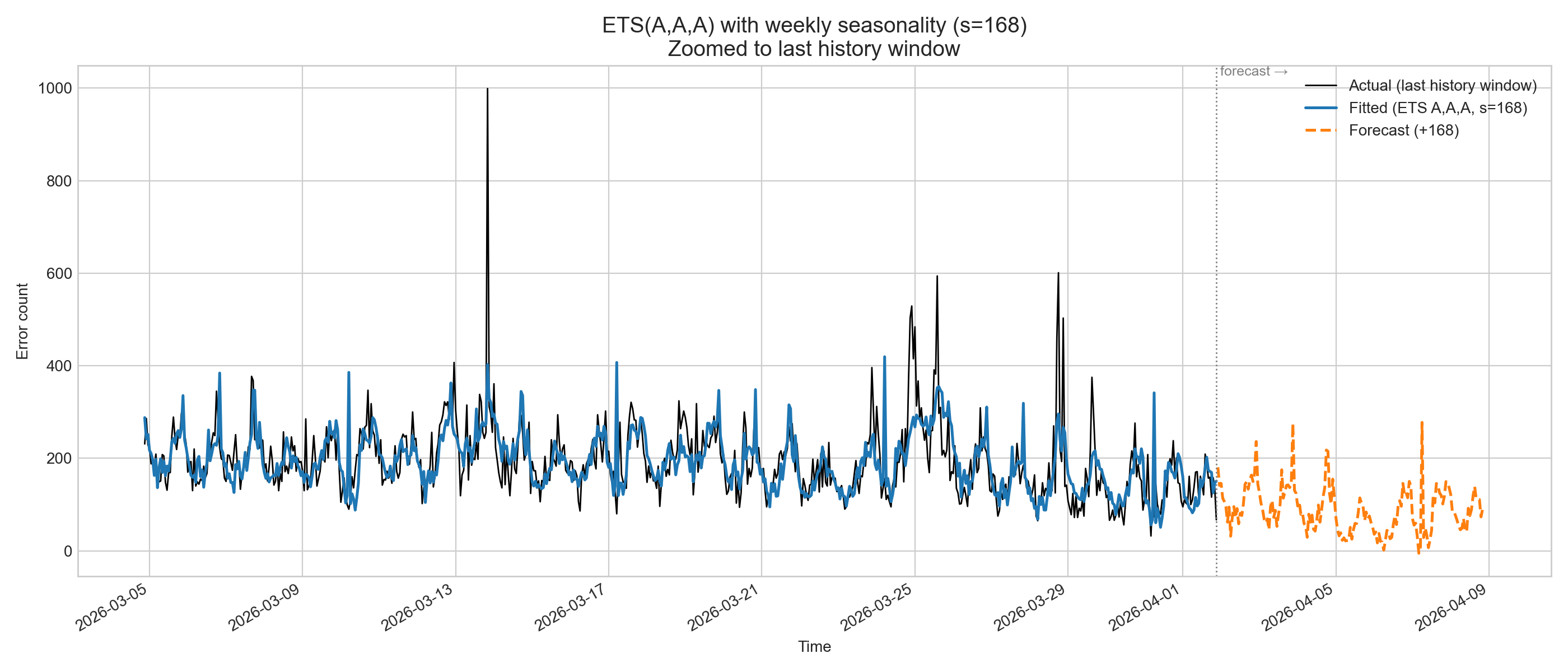
In this case, the ETS model with the best match has a seasonality of 168 hours (7 days or 1 week). If we plot this model, it looks like this:
Validating our ETS model
After selecting our model, we can now perform validation using data from our service that were not part of the training set and collected during a random period of the week. When we apply the model to this dataset, we get the following results:
| Metric | Training | Validation | Status |
|---|---|---|---|
| Rows | 885 | 30 | ✅ Good split |
| RMSE | ~78.21 | 41.01 | ✅ 50% improvement |
| MAE | ~41.47 | 30.41 | ✅ 26% improvement |
And if we plot it, we get the following:
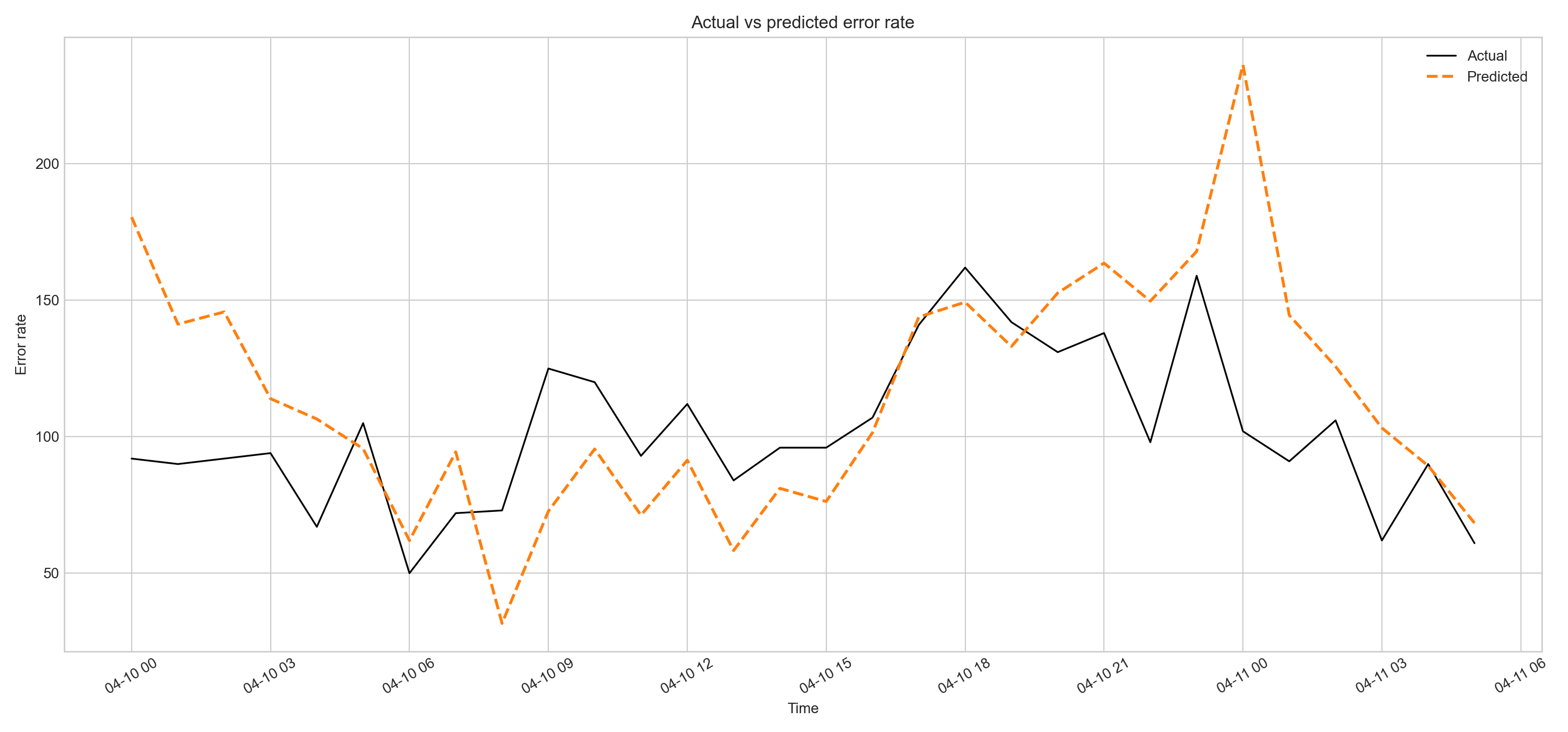
As we can see visually, our predictions — though not perfect — follow the trend of the actual data and can be used for forecasting.
Keeping things up to date
After creating a model that can be used for forecasting successfully, we need to ensure it is regularly refreshed with new incoming training data. This will keep our model reflecting current reality and ensure it can be relied upon for forecasting.
Linking predictive analysis with SRE
We now have a model that we can use to predict future events. In SRE, we define significant events as those with a high burn rate. A burn rate, by definition, is an error rate.
We can expand the use of burn rate from a tool used to detect significant events happening right now, to a tool that forecasts when significant events will occur. This is the crucial link between SRE and predictive analysis.
We can now use our model to predict when an event with a specific burn rate will happen and be on high alert, or alternatively perform proactive actions such as scaling up our clusters in advance.